SECTA Research
Client — SECTA Research
SECTA Research is a specialist advisory firm that uncovers how individuals and organizations bypass international sanctions.
Governments and private-sector teams rely on SECTA for straight-talking, evidence-led reporting that exposes weak spots and keeps defenses airtight.
Challenge
SECTA’s old site and communications didn’t reflect their depth of expertise—or their mission.
It felt crowded, dated, and anonymous. The brand lacked distinctiveness, which made recognition (and trust) harder to earn with high-stakes audiences.
SECTA also had a very specific ask:
Build a text-first, deliberately restrained identity—bureaucratic and technocratic by design. More public-interest investigator than consultancy. (Closer to a documentarian style you might associate with open-source investigation teams)

Solution
Brand Guidelines
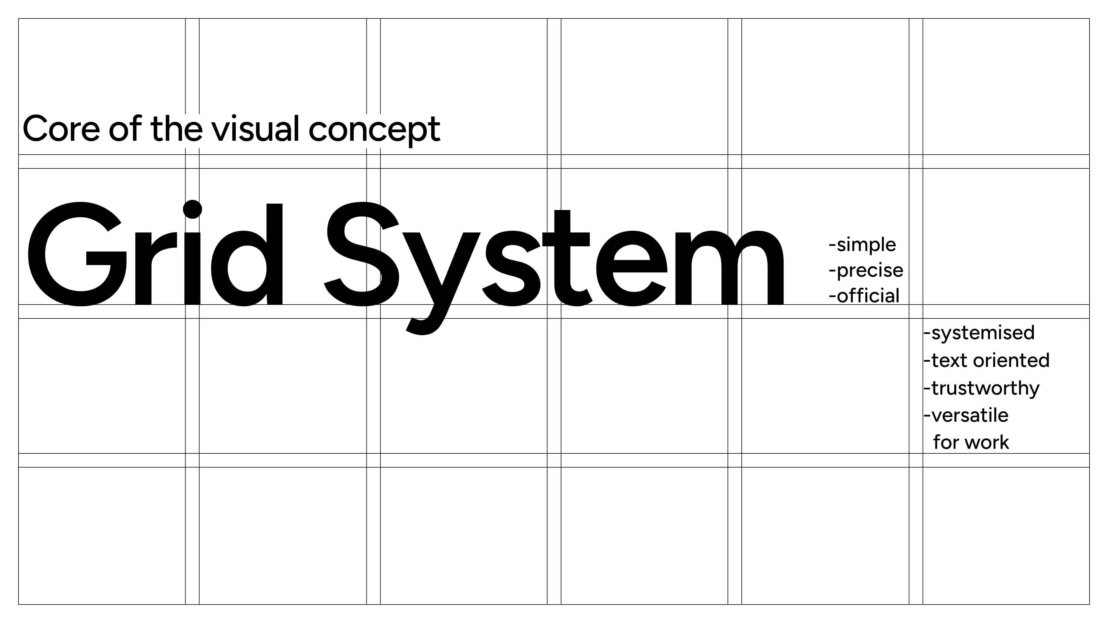
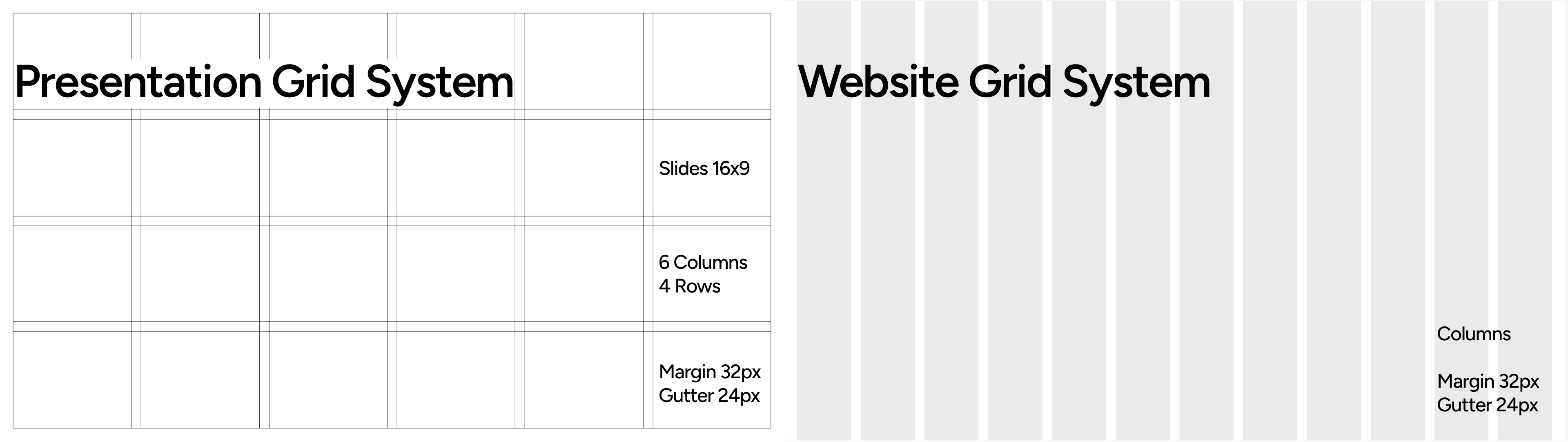
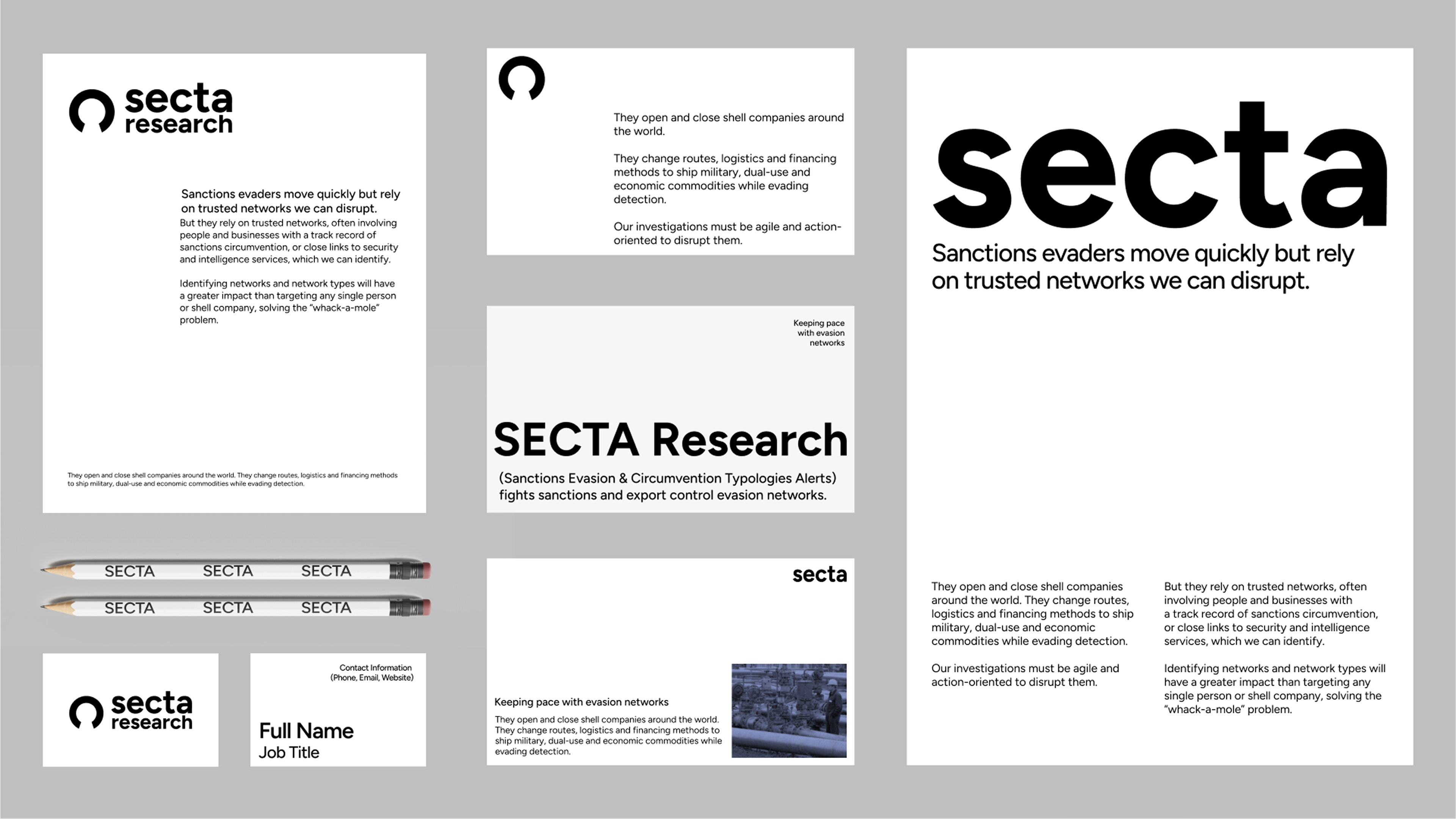
Grid System (Swiss-inspired).
A standardized typographic grid became the backbones of every deliverable—site, reports, briefs, and print.
The grid enforces hierarchy, keeps pages calm, and makes multi-author work look consistent.
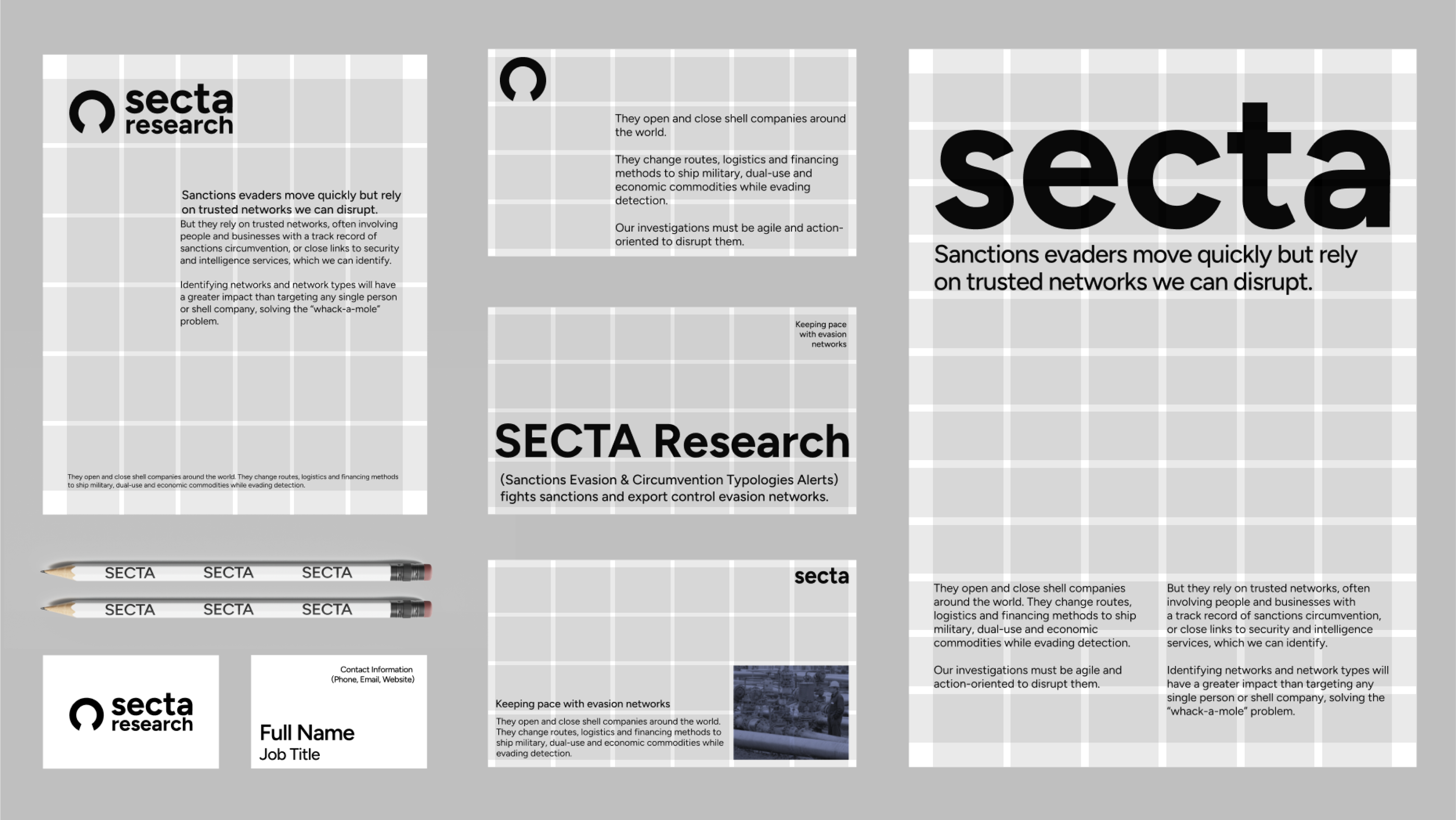
Logo: The Fractured Loop
A minimal loop mark broken at a single point—evasion interrupted.


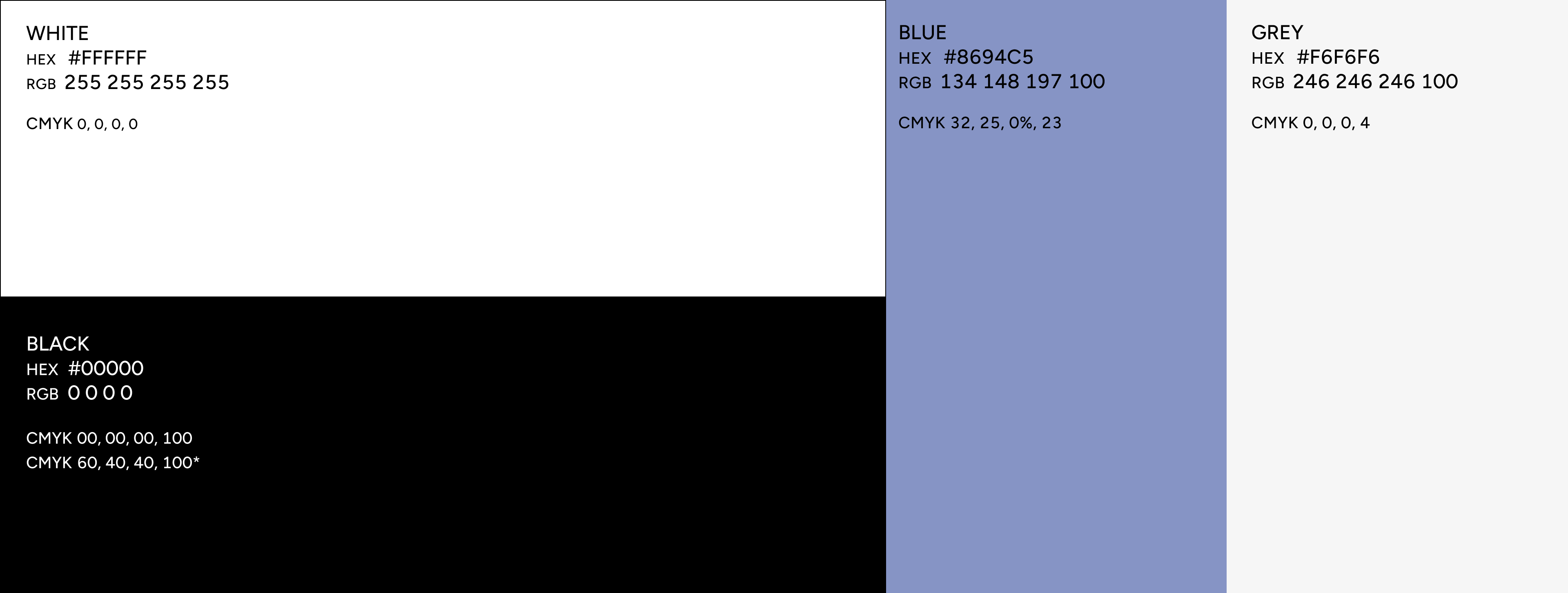
Palette:
We had to use a minimalistic pallets of white, grey, light blue and black to fit the minimalistic aethetic
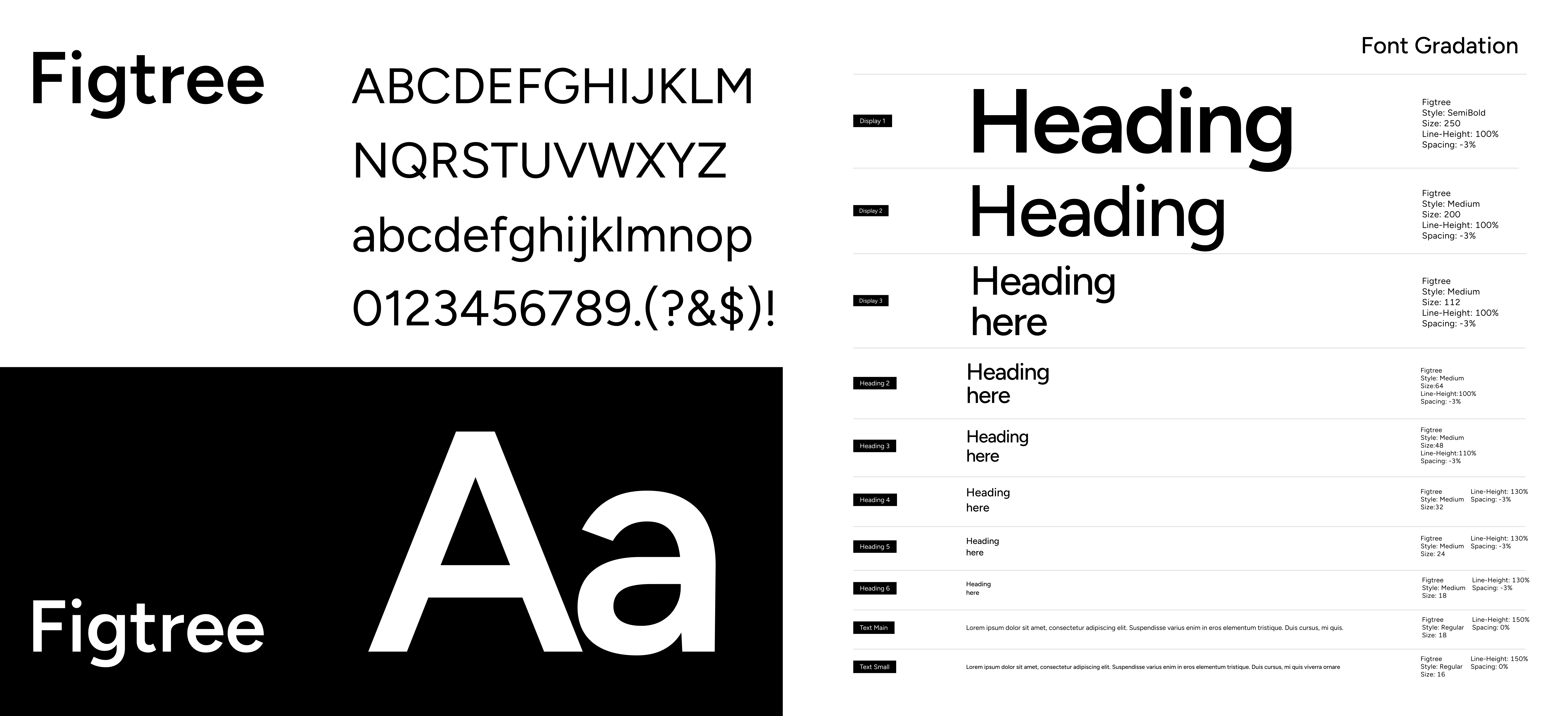
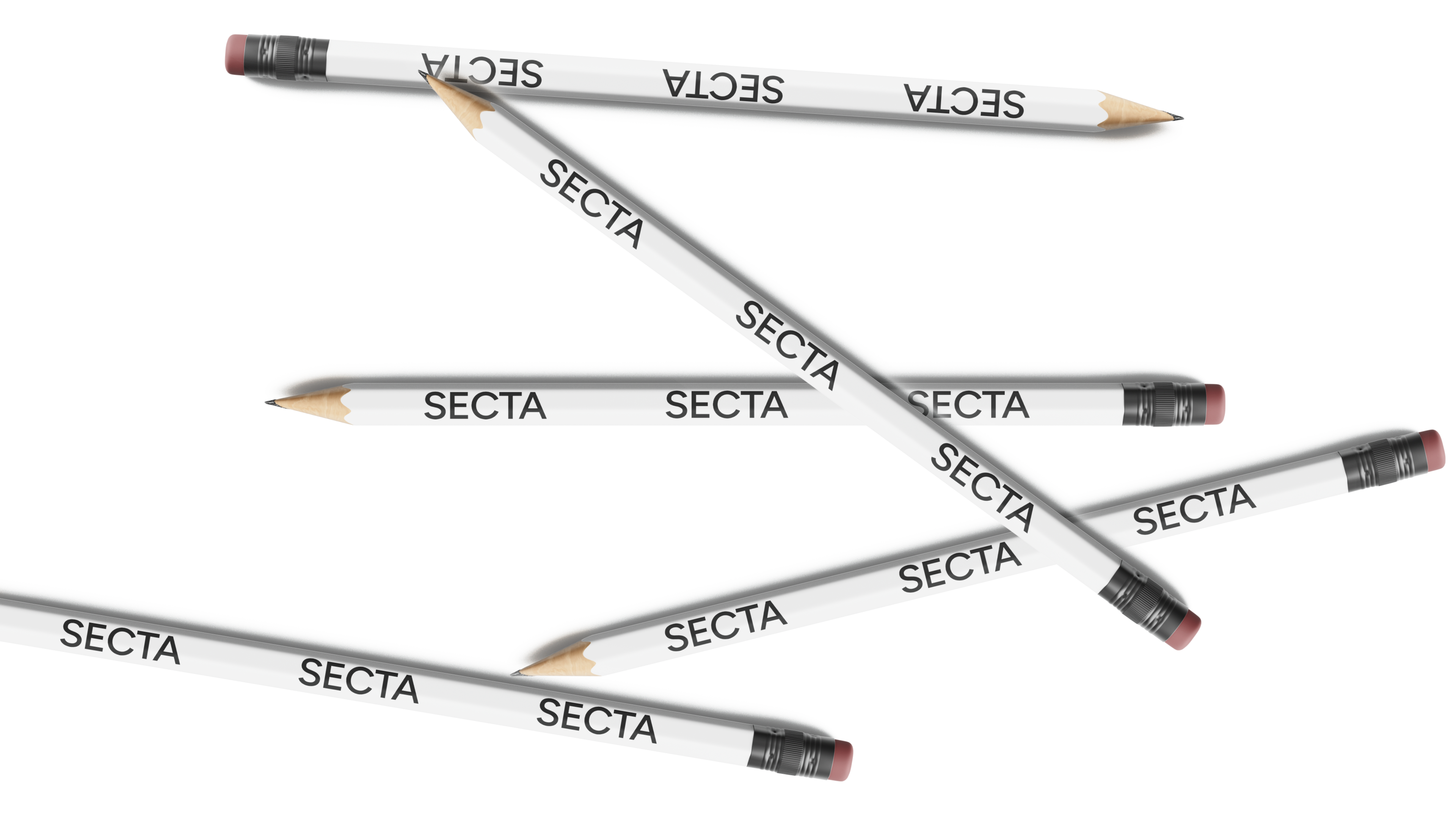
Typography:
Typography leads the design.
It’s not a decorative element — it’s the core of the system.
Application:


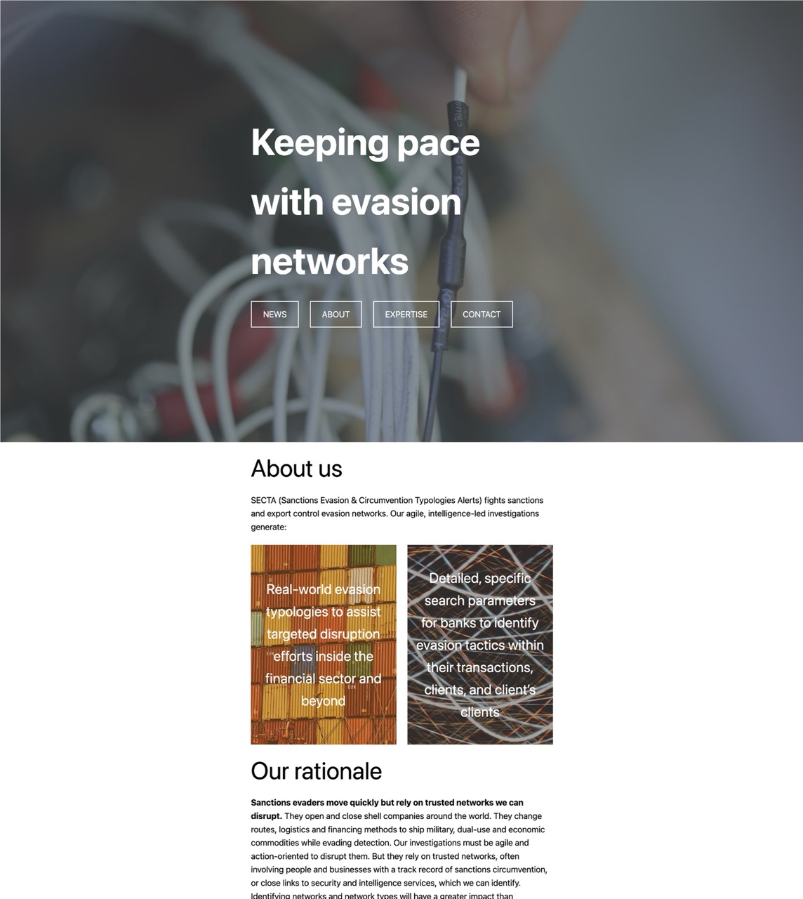
Website:
Built for reading. Clean grid, plenty of breathing room, clear headings, it was built uppon the idea of the Swiss grid to be text focused in the first place.
A secure email pipeline aligned with SECTA’s security standards.
Interactive preview:

© ANY KEY Creative Studio OÜ 2026